Stay Ahead of the Game: The Latest Web Design Trends

Introduction
Web design is continually evolving to keep up with new technology and consumer preferences as the digital world develops. Any website that wants to remain current, aesthetically pleasing, and user-friendly must keep up with these developments. Understanding the most recent web design trends is crucial whether you are a website owner, designer, or developer if you want to build a website that not only looks amazing but also offers the best user experience.
In order to maintain your website at the cutting edge of digital design, we will look more closely at some of the most significant web design trends to monitor in the upcoming months in this post. These trends, which range from the growth of dark mode to responsive design, will offer you a glimpse into the future of web design and help you create a website that is both visually stunning and functional for your users.
Gradients and Bold Hues:
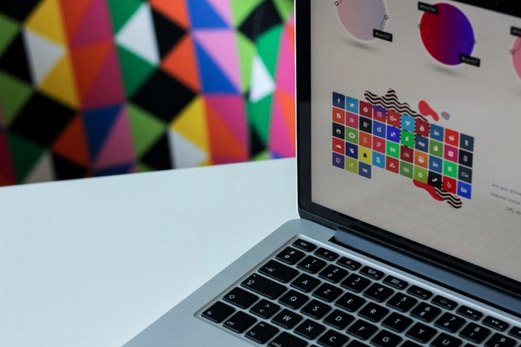
Recently, flat designs have gained popularity but now designers are going one step further by adding gradients and strong, vivid colors to their designs. In particular, website headers and calls to action are predicted to follow this trend in the next months. Designers may produce visually arresting designs that draw consumers in and stand out from the crowd by using eye-catching hues and gradients.
Gradients and strong colors may also give flat designs depth and dimension, which makes them more dynamic and compelling. These design components can also aid in establishing a hierarchy and directing users’ focus toward critical information. While designers continue to experiment, the trend towards vivid hues and gradients is probably going to continue as designers look for new ways to make their work more aesthetically pleasing and user-friendly.

Generally, a developing trend in design is the use of gradients and strong colors, especially in website headers and calls to action. These design components enable designers to produce visually arresting designs that draw consumers in and distinguish their websites from the competition. We can anticipate seeing even more fascinating and original applications of color and gradients in the realm of design as this trend develops.

3D Design Components:
3D design components have proliferated in web design during the past few years. Designers are increasingly using 3D models and animations to produce dynamic and compelling user experiences for online portfolios and product demonstrations. Designers can exhibit goods or services in a more immersive and dynamic way that helps people comprehend their features and advantages by including 3D elements into their designs.
Using 3D design features can also assist websites in standing out from the competition and leaving a positive impression on visitors. Websites may improve engagement and user retention by offering a visually striking and memorable experience. We may anticipate seeing even more inventive and unique usage of this trend developing as designers look for new methods to make their websites more dynamic and engaging, they are increasingly using 3D design components in their work.
Dark Mode:
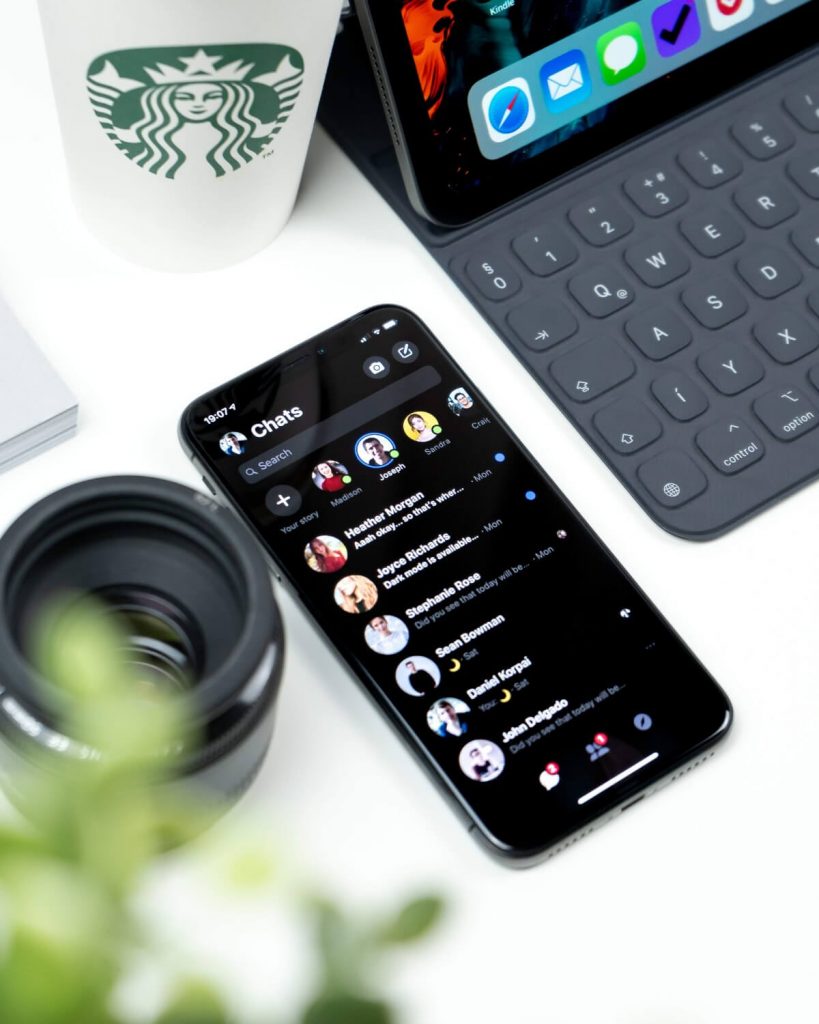
Mobile device users have been drawn to dark mode, a color scheme that uses light text on dark backgrounds, for a number of years. Yet, the field of web design is just now beginning to see this trend take off. We can anticipate a rise in the number of websites providing consumers with a dark mode option in the coming months. Dark mode’s aesthetic appeal and potential user experience advantages are two trends that are driving this one.
Reduced eye strain and fatigue is one of the dark mode’s key benefits, especially in dimly lit areas. This is due to the fact that black backdrops create less glare than light backgrounds, which can be particularly advantageous for users who spend a lot of time using a computer. Dark mode can also extend the life of a mobile device’s battery because it uses less energy to show dark than light pixels. The demand for dark mode in web design is projected to increase as more people become aware of these advantages.
In order to satisfy this need, designers are beginning to integrate dark mode options to their designs in addition to dark mode-specific components. This covers not only color schemes but also typeface and text size selections, along with other design components. Websites may provide a more individualized and adjustable user experience that better suits their users’ requirements and tastes by allowing them to choose between light and dark modes. We can anticipate seeing many more original and creative applications of dark mode in web design as this trend develops.
Minimalism:
For quite some time, minimalism has been a trend in internet design, and its appeal is only growing. In order to make websites easier to use and navigate, designers are actually continuing to hone and enhance minimalist design concepts. The use of simple, practical layouts that are clear and uncluttered is one of the main characteristics of minimalist design.
Designers may create a more streamlined user experience that is simpler to use and navigate by deleting unnecessary design elements. This covers anything from minimizing the number of buttons and links on a website to streamlining menus and navigation bars.
Furthermore, minimalist design frequently emphasizes the use of white space and straightforward font, which can assist in directing users’ attention to the most crucial parts of a website. Designers may build websites that are not only aesthetically beautiful but also very functional and simple to use by using these ideas.
Interactive Elements:
Since they may make websites more interesting and memorable, interactive components are becoming more and more common in web design. Animations, hover effects, and micro-interactions are a few examples of interactive elements. Designers may give consumers a more immersive and dynamic experience on their websites by including these design features, which can boost user engagement and retention.
One of the key benefits of interactive features is that they can contribute to the feeling of vitality and involvement on a website. Animations, for instance, can be utilized to highlight essential information, and hover effects can give users more context and feedback.
A website can feel more responsive and intuitive by using micro-interactions, such as brief animations or sound effects, in reaction to user activities.
Interactive components can also contribute to the development of a website that is more memorable and distinctive. Designers may create a website that stands out from the competition and creates a lasting impression on users by utilizing imaginative and original design components. In competitive industries where it’s critical to set oneself apart from rivals, this can be very crucial. As a result, as designers continue to push the limits of what is possible with digital design, we may anticipate seeing even more imaginative and original usage of interactive features in web design.

Video Backgrounds:

As embedding video technology develops, video backdrops are a common element on websites today. They are a fun method to enhance your website’s visual appeal and increase user engagement. You may communicate your message in a compelling style that grabs the attention of your audience and keeps them on your website for extended periods of time by using video backgrounds.
You may show off your inventiveness to potential customers and develop a distinctive business identity by using video backgrounds. Businesses in sectors like entertainment, fashion, and sports, where visual impact is crucial, benefit especially well from this capability. Video backdrops are becoming a requirement for any website that wishes to stand out and leave a lasting impression as they become more widely available and reasonably priced.
Increased Attention to Accessibility:
Accessibility is a growing concern in web design, and designers are working hard to make their sites usable by as many users as possible, regardless of ability. This change in strategy reflects a growing understanding of the necessity of making the internet more inclusive and the understanding that accessibility benefits everyone, not just those who have disabilities. Web designers are assisting in the development of a more varied and equal online community by giving accessibility a high priority in their designs.
Web designers are combining a variety of features and design components, such as straightforward navigation, legible typography, and elucidating alt text for images, to achieve accessibility.

To make sure that their websites are accessible, they are also adhering to accepted standards and criteria, like the Web Content Accessibility Guidelines (WCAG). Web designers who prioritize accessibility not only produce more user-friendly websites, but also help to create a more inclusive and accessible online space.
Visit TechBusBee for a comprehensive guide on the Best #1 Solution to Make Your Website ADA Compliant and Ensure ADA Compliance.
Responsive Design:
Responsive design for websites is increasingly being seen as a need in the current digital era rather than a “nice-to-have.” Because more and more people are using mobile devices to access the internet, it is essential that websites be designed to look and work properly on all screen sizes. In order to ensure that consumers can access their material without difficulty, regardless of the device they’re using, website designers must stress responsiveness in their designs.
By designing a flexible layout that can adjust to various screen sizes and resolutions, responsive design enables a consistent user experience across devices.
Designers may guarantee that users can access all the features and information of a site, regardless of the device they’re using, by building sites with responsiveness in mind. This may drive greater engagement, lower bounce rates, and eventually increase conversions.
Moreover, mobile-friendly websites are given a ranking advantage by Google and other search engines, making responsive design crucial for search engine optimization (SEO). In other words, having a responsive website will assist increase the exposure of your website and bring in more natural search engine traffic. Responsive design is becoming an essential component of any effective website strategy as more and more people access the internet via mobile devices.
Learn how to utilize responsive website design with our comprehensive guide.
Split-Screen Layouts:
Due to its capacity to offer two pieces of material side by side while yet retaining the user’s attention, split-screen layouts are growing in popularity in web design. When presenting comparisons or opposing viewpoints, this style can be extremely helpful because it provides a visually appealing approach to convey the information. Split-screen layouts can be useful for drawing attention to several calls to action or showing various aspects of a good or service.
Split-screen layouts also make it possible to divide material into smaller, easier-to-consume portions, which can enhance user interaction and engagement with the website. Split-screen designs can assist consumers navigate the content and quickly discover what they’re looking for by using a clear visual hierarchy and design components.
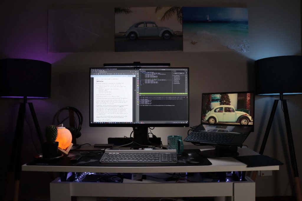
Website designers now have a new tool at their disposal for producing aesthetically pleasing and engaging websites thanks to the rising popularity of split-screen layouts.
Split-screen layouts might not be suitable for every website or every sort of content, it’s vital to keep in mind. When working with sophisticated content that need more space or on smaller devices, this style can be difficult to apply. However, if the content shown in each area is unbalanced or the layout is cluttered, split-screen designs may be less effective. Before implementing a split-screen layout, it is crucial to take the demands of the user and the objectives of the website into account, just as with any other design element. Split-screen layouts may be a potent tool for producing a compelling and useful user experience when utilized properly.
Conclusion
Web design trends are always evolving as the internet and technology advance. If you want your website to stay current, useful, and attractive, you must keep up with these trends. You can make sure that your website stands out and makes an impression on your visitors by adopting the newest design trends.
Web designers are constantly experimenting with new techniques to improve the user experience and make websites more interesting and useful, from video backgrounds to split-screen layouts. Although staying on top of current trends can be difficult, doing so is necessary to keep your website competitive in the modern digital environment.
It’s not necessary to redesign your website entirely in order to include the newest design trends. Even minor changes, like altering your typography or color scheme, can have a big influence on how attractive and user-friendly your website is. Additionally, you can draw inspiration from these trends to make a one-of-a-kind design that expresses the character and principles of your company.
In summary, if you want to construct a website that stands out in today’s digital landscape, you must stay current with web design trends, which are constantly changing. You can make certain that your website remains pertinent, practical, and interesting for your visitors by embracing the most recent design trends. Hence, don’t be scared to use new design techniques and make a website that showcases your brand’s distinct personality.
